top of page
HEALTH PLATFORM REDESIGN
UI/UX DESIGNER
FALL 2020
Figma

INTRODUCTION
Consulted with PromptHealth to reveal their current products and provide design solutions for both mobile and website to solve users' needs and business challenges.
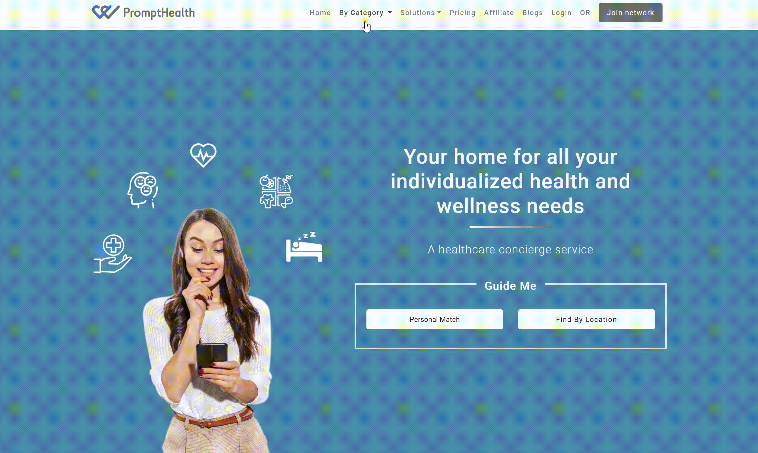
The original website
Identify the problem
Desktop version

Poor Navigation & Confusing Dropdown menu
The original website menu bar has too many options available that users will found it difficult to properly use.
Solution: Took the entire By Category out and reorganized it into 9 sections. Placed it on the homepage to let the users know the services provided upfront.

The About and Misson are text-heavy, user will found it overwhelming to read.
Solution: Shorten the wording and use the light-colour background to achieve freshness.

How it Works looks like four buttons instead of steps.
Solution: Use a vertical layout to create the flow of the website as well as make sure the users know this is a step-by-step tutorial.

Mobile version
Before

Move icon placement to present better visual cue
Simple the information section for a clean look
Use modular design to create a clear hierarchy
After


Before
Redesign the icon to have a consistent style
Increase the whitespace and use the rounded corner for modern looks
Adjust the overall layout

After
bottom of page